Ajax Updates |

| Build Your Own Firefox Extension Posted: 23 Dec 2009 10:16 AM PST This is a follow-up article to my recent ebook, Build Your Own Firefox Extension—an extra selection of useful tips, tricks, and hacks that I've collected from my experience with building extensions for Firefox, including CodeBurner, the SitePoint Reference extension. Basic knowledge of how to build a Firefox extension is assumed, so you might like to grab your free copy of the ebook first, if you've yet to do so already. Most of what's here is not explicitly documented at the Mozilla Developer Center (MDC), either because it's still on their "to do" list, or because I made it up myself. Some of it is well documented, but it's so useful that I thought it was worth directing your attention to it anyway. The tips are listed in order of complexity, beginning with the shortest and simplest, and moving onto the longer and more complex ideas. Please note: in many places throughout this article, I'll be creating little methods to package-up self-contained techniques, and in all cases I'll create them as top-level functions (using the function keyword). In practice though, you should create them as methods of your main extension object. Many XUL elements are without support for the CSS background-image property, but many of them do support list-style-image. This includes menuitem, button, and textbox. You could use these for adding your application's icon to its main menu item, or affixing a little magnifying glass icon to a textbox used for searching: textbox[type="search"] { list-style-image:url(chrome://myextension/content/images/magglass.png); } 2. Make tab Elements Keyboard-accessible in Mac OS X elements are natively inaccessible to the keyboard in Firefox for Mac OS X. To make them accessible you need to manually insert them into the tab order, by adding a tabindex attribute with the value 0. This value is effectively "auto", and places the element at its source-order position in the overall tab order: <code><tab label="About" tabindex="0"/></code> Once that's done you can use the arrow keys to switch between tabs, just the same as in Windows and Linux. A keyboard-focused tab in Mac OS X 3. Reference the Original Mouse-target of a Context Menu EventWhen you click on an item in an XUL context menu, the event <code><popup id="contentAreaContextMenu"> <menuitem label="This bloke won't haggle" oncommand="offerMeFourteen(document.popupNode)" </code><code> /></code></menuitem></popup></code> 4. Preventing an Element from Inheriting |
| Posted: 23 Dec 2009 09:47 AM PST CSS and Netscape 4.xx Issues The syntax for linking an external style sheet is: <link rel="stylesheet" href="Style.css" type="text/css"> It makes sense to use two different external styles – one for IE and NN6, the other one for NN4.xx. In doing so, you could adapt your font sizes, or background properties, or the other styles that NN4.xx has problems with. To do that you can use the fact that NN 4.xx does not recognize the @import. </link><link rel="stylesheet" href="StyleNN.css" type="text/css"> <style type="text/css"> @import url(Style.css); /*IE and NN6x styles*/ </style> Explanation: NN4.xx does not recognize the @import, so it uses the style sheet. IE and NN6 merge both stylesheets, but by placing the @import sheet after the style, you give it more importance, therefore IE and NN6 will give you the styles in the @import.  Related Listings:
|
| Posted: 23 Dec 2009 09:41 AM PST Whether your main business is Web design or backend development, chances are you spend a fair amount of time creating forms for user input. So you already know that the default appearance of forms isn’t always appropriate for the look and feel of your site. In this article we’ll look at how you can use CSS to create attractive and usable forms. It’s possible to change the default look of form elements by styling their html tags: input, select and textarea. The input Tag Defining rules for the input tag will change any instance of that tag in your document. For example, if I wish all elements to have a purple background, I could define the following in my style sheet. input { background-color: #666699; } This will add a purple background color to those elements that are marked up using the input tag The select tag creates a list menu. You can create rules for select which will affect any list menus in your document. select { background-color: #666699; color: #ffffff; }
The textarea Tag The textarea tag marks up multiple line text input fields. Once again, setting rules for textarea will change the look of all of these elements in your document. textarea { background-color: #666699; color: #ffffff; }
The form Tag You can also style the form tag itself, adding borders, background colors and adjusting the margins and padding. Form is a block level element, so you can change the way it displays in much the same way that you would style a paragraph. form { border: 1px solid #666699; padding: 5px; }
Simply defining rules for your elements has some obvious problems. You probably don’t want those funny boxes around your checkboxes and radiobuttons; you may also want to create a different appearance for text input boxes and buttons. Perhaps you’d like to have several different form styles available in your style sheet, each serving a different purpose. To do this, you can create classes and apply them to individual form elements. For example, this class in the style sheet: .texta { font-size: 10px; background-color: #CCCCCC; border: 1px solid #666666; can be applied to a form element like so:<…………. > input class="texta" name=" type=" Any other form elements or input tags in the document will remain unstyled, as this class is not applied to them.
When I begin work on a site that’s going to involve a lot of forms, one of the first things I do is create classes for my standard forms in the style sheet. It doesn’t matter if the style needs to change at a later date — that simply involves tweaking the values in the style sheet. The important thing is that classes are applied from the outset, so that any changes affect all forms on the site. To conclude this article here are a couple of typical forms — for login and user registration — that show how we can use CSS to turn forms into an attractive interface feature. The first form we’ll look at is a login form. You might find a form like this on a site that requires the user to sign in, in order to access more features (e.g. an online bulletin board). The HTML looks like this: < ...........................> form id="login" action="#" method="post"> < ....> label Username: < ...........................> input name="user" type="text" tabindex="1" / < .......> /label < .....> label Password: < ..........> input name="password" type="password" tabindex="2" < ....................../> input name="Submit" type="submit" value="Submit" tabindex="3" < .......> /label < .......> /form Without any styling, the form looks like this:
First, we’ll style the form tag itself. In an attached style sheet add the following CSS: <code>form#login { background-color: #CCCCCC; color: #000000; border: 1px solid #999999; font-family: Verdana, Arial, Helvetica, sans-serif; font-size: 10px; text-align: right; }</code> We only want the form with the id of #login to be styled, and the rules we’ve defined give this kind of form a background color, a default text color, and a border. We’ve set the font family and size of the text within the form, and right-aligned the form’s contents.
The input fields for a login form often need only be small, as the input is simply a short username and password. We can set the width of the text input boxes using CSS. To do this, I’ve created a class called '#login .text’. <code>#login .text { font-family: Verdana, Arial, Helvetica, sans-serif; font-size: 11px; width: 100px; margin-right: 6px;</code> } I’ve also added a margin-right setting, to insert a little space between the end of the input box and the start of the next label. To make these changes affect the form, we need to add the class name to our username and password fields. <code><input name="user" type="text" id="user" tabindex="1" /> <input name="password" type="password" id="password" tabindex="2" /></code>
The final step with this form is to style the submit button, which is looking a bit large and clunky at the end of the form right now. So we’ll create another class, this time for a button within the #login form. <code>#login .buttons { font-family: Verdana, Arial, Helvetica, sans-serif; font-size: 10px; background-color: #333333; color: #FFFFFF; margin-right: 6px; }</code> Apply this class to your submit button to see the completed login form. <code><input name="Submit" type="submit" tabindex="3" value="Submit" /></code>
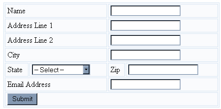
I have created this form without using tables for the layout, however, all the techniques we’ve discussed could be applied to a form that’s within a table. The next example will look at styling within tables. <code><form name="signup" id="signup" method="post" action="#"> <table> <tr> <td colspan="2"><label for="name">Name</label></td> <td colspan="2"> <input type="text" name="name" id="name" tabindex="1" /></td> </tr> <tr> <td colspan="2"><label for="address1">Address Line 1</label></td> <td colspan="2"> <input type="text" name="address1" id="address2" tabindex="2" /></td> </tr> <tr> <td colspan="2"><label for="address2">Address Line 2</label></td> <td colspan="2"> <input type="text" name="address2" id="address2" tabindex="3" /></td> </tr> <tr> <td colspan="2"><label for="city">City</label></td> <td colspan="2"> <input type="text" name="city" id="city" tabindex="4" /></td> </tr> <tr> <td><label for="state">State</label></td> <td><select name="state" id="state" tabindex="5"> <option value="">-- Select ---</option> <option value="AL" >Alabama</option> <option value="AK" >Alaska</option> </select></td> <td><label for="zip">Zip</label></td> <td> <input type="text" name="zip" id="zip" tabindex="6" /></td> </tr> <tr> <td colspan="2"><label for="email">Email Address</label></td> <td colspan="2"><input type="text" name="email" id="email" tabindex="7" /></td> </tr> <tr> <td colspan="4"><input type="submit" name="Submit" value="Submit" tabindex="8" /></td> </tr> </table> </form></code> Here it is in the browser.
This form is laid out using a table. To keep the table mark-up down to a minimum, we can use CSS to style both the table and the form. First, to style the table, add the following to your style sheet: <code>#signup table { background-color: #F9FBFD; color: #000000; width: 440px; border: 1px solid #D7E5F2; border-collapse: collapse; }</code> #signup td { border: 1px solid #D7E5F2; padding-left: 4px; } The code dictates that these rules apply to any table and td that appears within an area with an id of 'signup’. As such, these rules won’t affect the look of any other tables on your site. Most of this should look fairly familiar by now, however, note the line: <code>border-collapse: collapse;</code> This collapses the borders, so that space doesn’t appear between each cell in the table. To demonstrate the effect of this code, here’s how the form appears when the border-collapse line is removed from the CSS. Here’s the form again, this time with the border-collapse line included in the CSS file:
There are two types of cells in the form: those that contain labels, and those that contain form fields. Differentiating between these cell types can make the form less cluttered and easier to scan — particularly if it’s lengthy. Create two classes in your style sheet – ' Add the class ' <code><tr> <td colspan="2"><label for="name">Name</label></td> <td colspan="2"> <input type="text" name="name" id="name" tabindex="1" /> </td> </tr></code> I’ve also created special classes for the smaller cells (in my form, these contain the select menu for state, and the zip code field). I’ve named these ' In your style sheet, add the following: <code>.labelcell { font: 11px Verdana, Geneva, Arial, Helvetica, sans-serif; color: #3670A7; background-color: transparent; width: 220px; } .fieldcell { background-color: #F2F7FB; color: #000000; text-align: right; margin-right: 0px; padding-right: 0px; } .smalllabelcell { font: 11px Verdana, Geneva, Arial, Helvetica, sans-serif; background-color: transparent; color: #3670A7; width: 100px; } .smallfieldcell { background-color: #F2F7FB; color: #000000; text-align: right; }</code> You should end up with something that looks like this.
You can now style the form fields within these cells. As we’ve already applied a class to the td, we can simply choose to style all input tags within the td to which that class is applied. Add the following to the style sheet: <code>.fieldcell input { width: 200px; font: 11px Verdana, Geneva, Arial, Helvetica, sans-serif; background-color: #D7E5F2; color: #102132; border: 1px solid #284279; margin-right: 0px; } .smallfieldcell input { width: 100px; font: 11px Verdana, Geneva, Arial, Helvetica, sans-serif; background-color: #D7E5F2; color: #102132; border: 1px solid #284279; } .smallfieldcell select { font: 11px Verdana, Geneva, Arial, Helvetica, sans-serif; background-color: #D7E5F2; color: #102132; border: 1px solid #284279; }</code> Adding a special class for our submit button finishes the job. <code>.button { font: 11px Verdana, Geneva, Arial, Helvetica, sans-serif; background-color: #D7E5F2; color: #102132; margin-left: 12px; margin-top: 3px; margin-bottom: 2px; }</code>
In this article, we’ve explored some of the ways in which you can use CSS to change the look and feel of html forms. We now know how to:
These techniques should work well in modern, relatively standards-compliant browsers. However, note that the rendering of form fields styled with CSS is one of the places where Netscape 4.* can behave strangely. If you make extensive use of CSS in your forms, you may wish to attach a separate 'form styles’ style sheet using the @import method. This will enable you to hide from Netscape 4 styles that will cause it problems. Source:http://articles.sitepoint.com/article/style-web-forms-css/4 Related Listings:
|
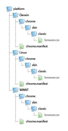 The folder hierarchy for platform-specific style sheets
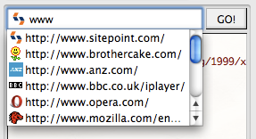 A textbox with a history auto-complete menu, showing entries we added programmatically
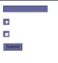


| You are subscribed to email updates from Ajax Updates To stop receiving these emails, you may unsubscribe now. | Email delivery powered by Google |
| Google Inc., 20 West Kinzie, Chicago IL USA 60610 | |


0 comments:
Post a Comment
Note: Only a member of this blog may post a comment.